Analysis
Exploratory Analysis
For Analysis of the data, I determined the correlation between percentage of votes cast for each candidate and percentage of each demographic represented in the population by using a technique called linear regression. Linear regression is a statistical analysis technique which can be used to show the correlation between two variables. The regression equation is:
\(y = B0 + B1*x\)
I then found the Intercept, slope, and r-squared value of the regression line using the mean, sd, and cor functions in R. I then graphed the regression lines and used the equations to find if there was a positive, negative, or nonexistent correlation between the demographic data and the election data. This regression would also show if a demographic favored one of the candidates more in one of the elections than the other. If this is the case that could mean the Republican or Democratic candidate did better in targeting those voters in one election than the other.
To test whether the results were statistically significance I calculated the p-value of each linear correlation. Significance value = 0.05. If the p-value was less than the significance value then the results were statistically significant and there was a linear relationship between the variables.
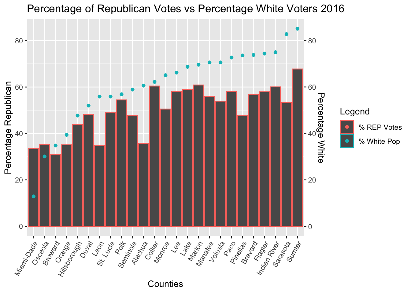
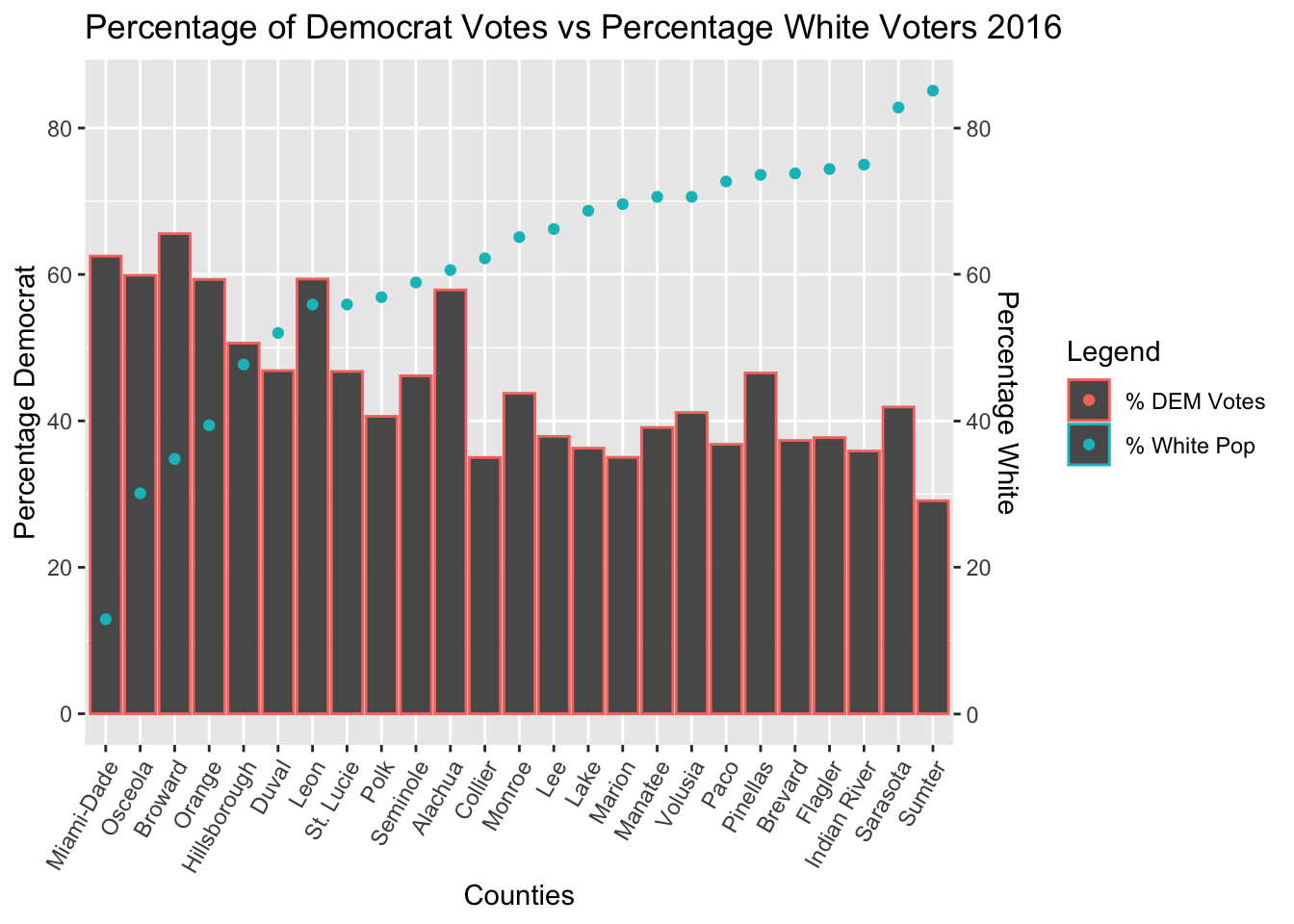
Linear Regression of White Population Data
The Regression Results of White Voter Data showed that the strongest correlation between votes and voters occurred in the 2016 election
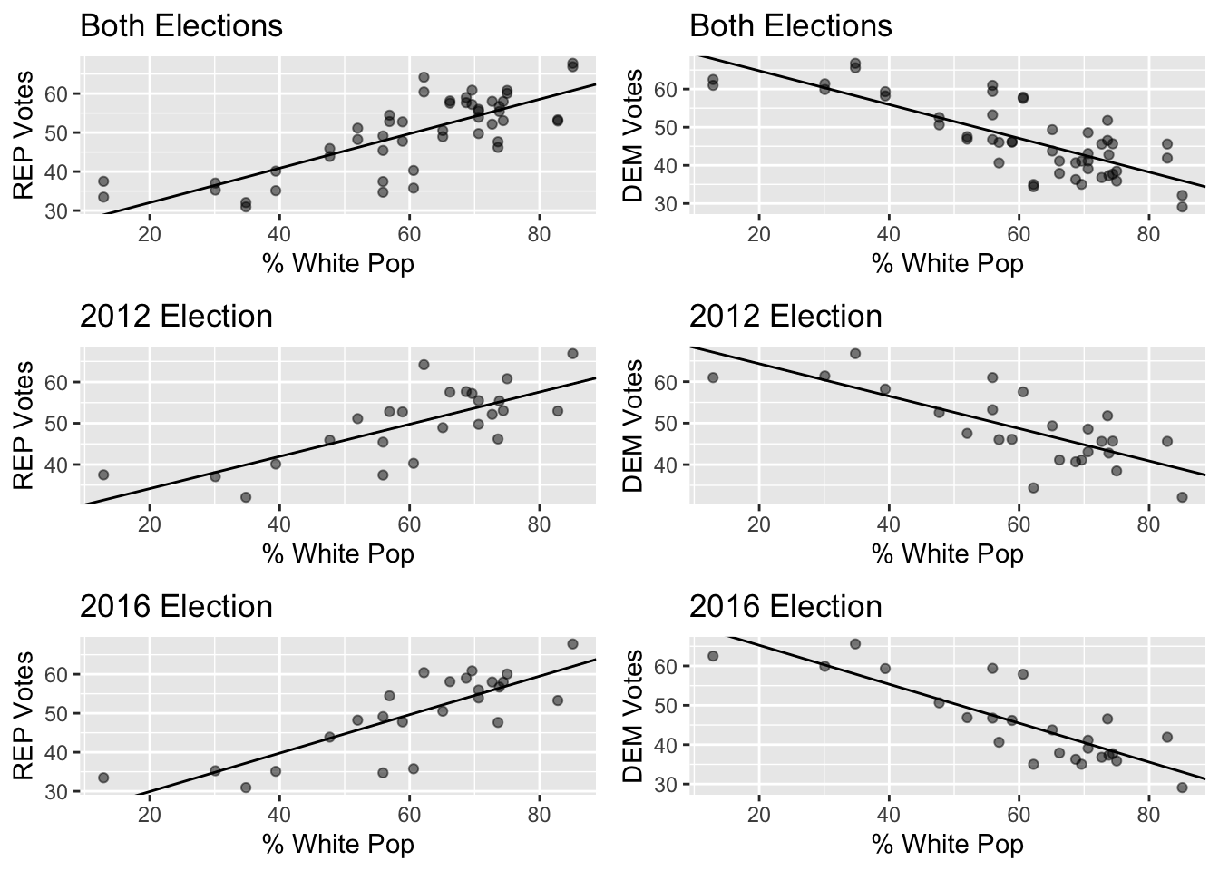
| Election Ticket | Regression Equation | R-squared value | P-value |
|---|---|---|---|
| REP 2012 (Romney/Ryan) | y = 0.391x + 26.337 | 0.55731 | 1.822e-05 |
| DEM 2012 (Obama/Biden) | y = -0.391x + 72.154 | 0.570574 | 1.27e-05 |
| REP 2016 (Trump/Pence) | y = 0.494x + 20.037 | 0.65351 | 1.01e-06 |
| DEM 2016 (Clinton/Kaine) | y = -0.495x + 75.146 | 0.68758 | 3.02e-07 |
Counties with larger white populations favored Republican tickets more, and favored Donald Trump in 2016 much more than Mitt Romney in 2012. These results are statistically significant, and there is a correlation between percentage of white people in a county and that county’s voting.
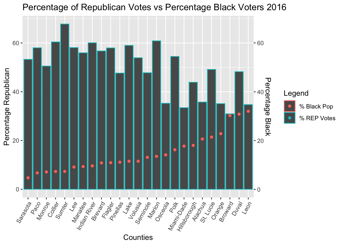
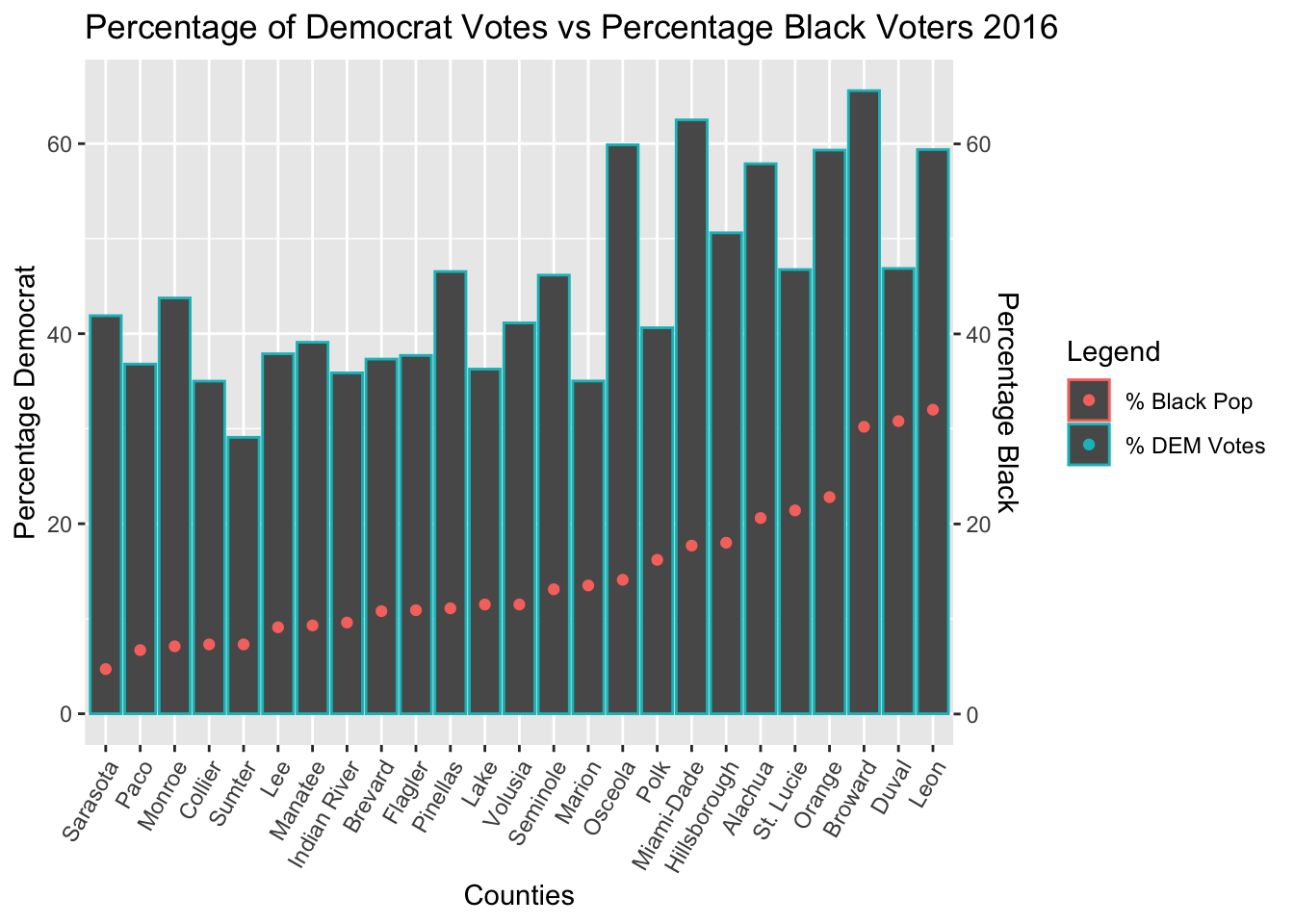
Linear Regression of Black Population Data
The Regression Results of Black Voter Data showed that the strongest correlation between votes and voters occurred in the 2016 election
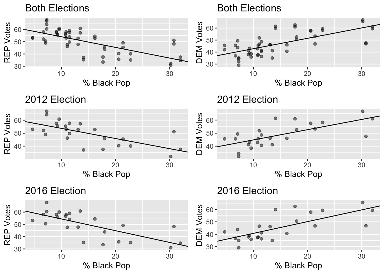
| Election Ticket | Regression Equation | R-squared value | P-value |
|---|---|---|---|
| REP 2012 (Romney/Ryan) | y = -0.783x + 61.524 | 0.46325 | 0.0002 |
| DEM 2012 (Obama/Biden) | y = 0.784x + 36.936 | 0.47609 | 0.0001 |
| REP 2016 (Trump/Pence) | y = -0.958x + 64.028 | 0.51034 | 6.04e-05 |
| DEM 2016 (Clinton/Kaine) | y = 0.948x + 31.236 | 0.52304 | 4.42e-05 |
Counties with a larger black population favored the democratic tickets more, and favored Clinton in 2016 more than Obama in 2012.There is a statistically significant linear correlation between percentage of black people in a county and percentage of democrat and republican votes.
Linear Regression of Native American Population Data
There is no significant correlation between Percentage of Native Americans in a County and the percentage vote for each candidate. Their population is too small to make a statistical inference based on it
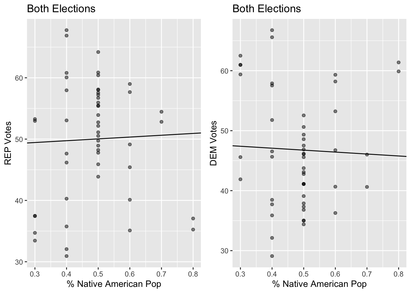
| Party Ticket (2012 and 2016) | Regression Equation | R-squared value | P-value |
|---|---|---|---|
| REP | y = 2.968x + 48.553 | 0.0012981 | 0.804 |
| DEM | y = -3.243x + 48.379 | 0.001558 | 0.786 |
There is no statistically significant correlation between Percentage of Native Americans in a County and the percentage vote for each candidate.
Linear Regression of Pacific Islander Population Data
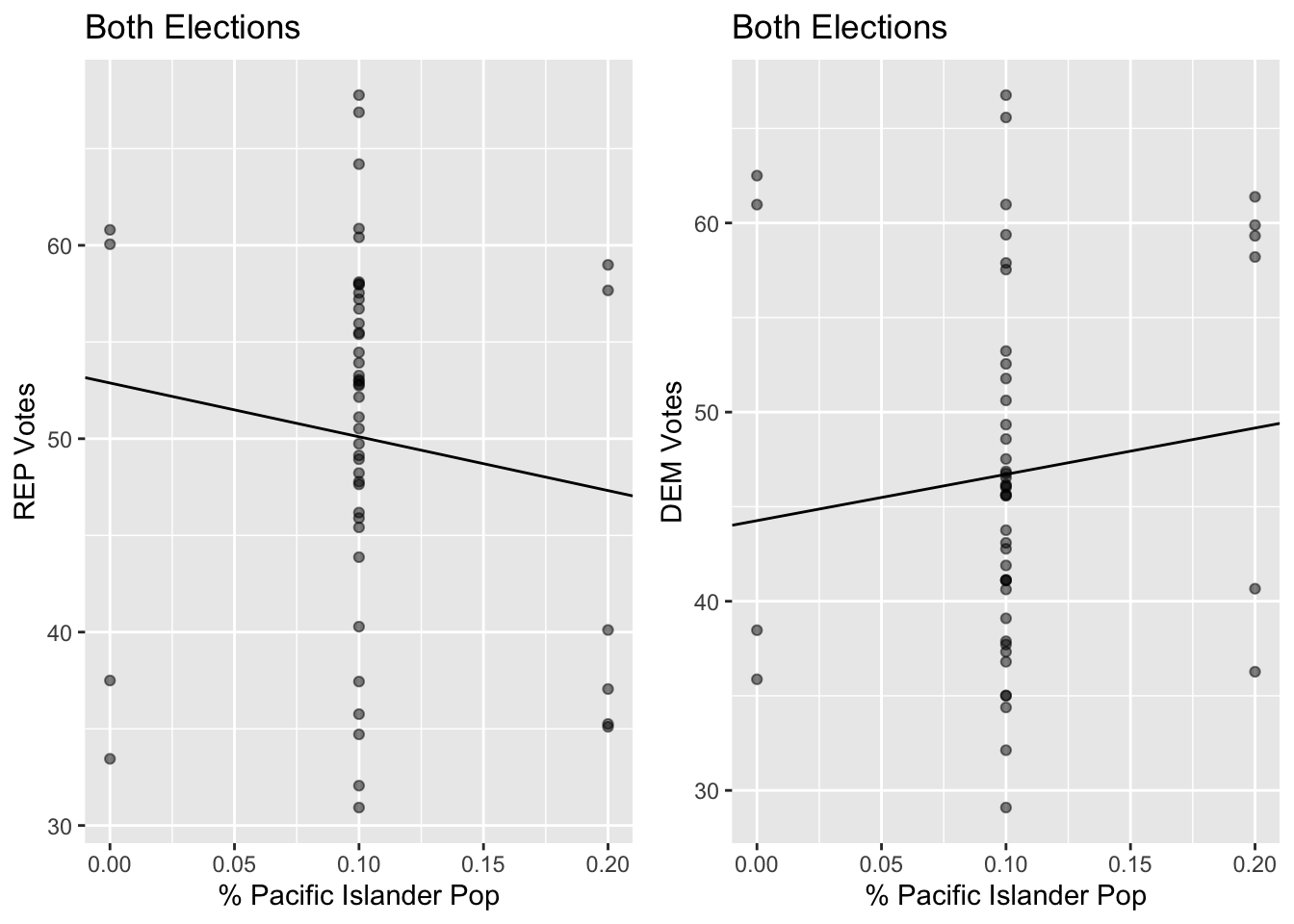
| Party Ticket (2012 and 2016) | Regression Equation | R-squared value | P-value |
|---|---|---|---|
| REP | y = -27.827x + 52.884 | 0.016961 | 0.367 |
| DEM | y = 24.488x + 44.262 | 0.013209 | 0.427 |
There is no statistically significant correlation between Percentage of Hawaiians or Pacific Islanders in a County and the percentage vote for each candidate. Their population is too small to make a statistical inference based on it
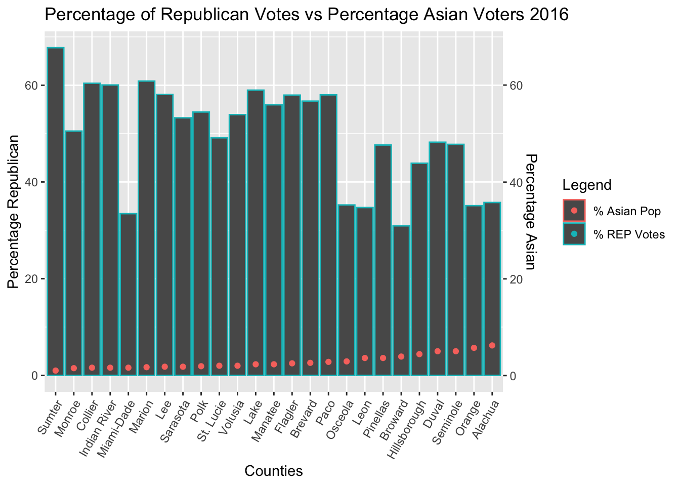
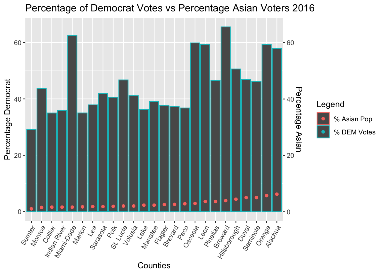
Linear Regression of Asian Population Data
The Regression Results of Asian Voter Data showed that the strongest correlation between votes and voters occurred in the 2016 election
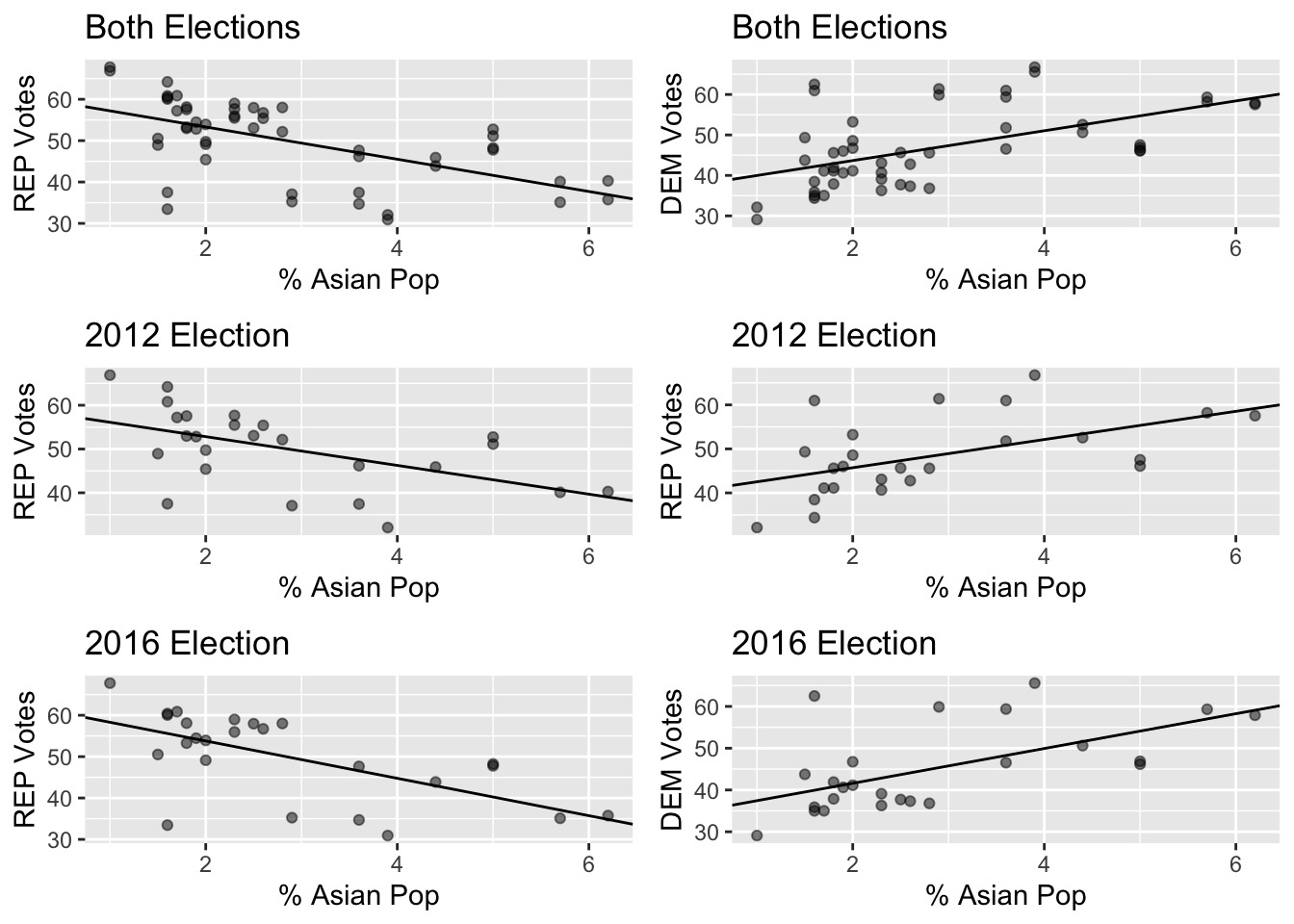
| Election Ticket | Regression Equation | R-squared value | P-value |
|---|---|---|---|
| REP 2012 (Romney/Ryan) | y = -3.284x + 59.393 | 0.28008 | 0.0065 |
| DEM 2012 (Obama/Biden) | y = 3.207x + 39.313 | 0.27325 | 0.0073 |
| REP 2016 (Trump/Pence) | y = -4.518x + 62.839 | 0.38962 | 0.00085 |
| DEM 2016 (Clinton/Kaine) | y = 4.169x + 33.27 | 0.347397 | 0.00193 |
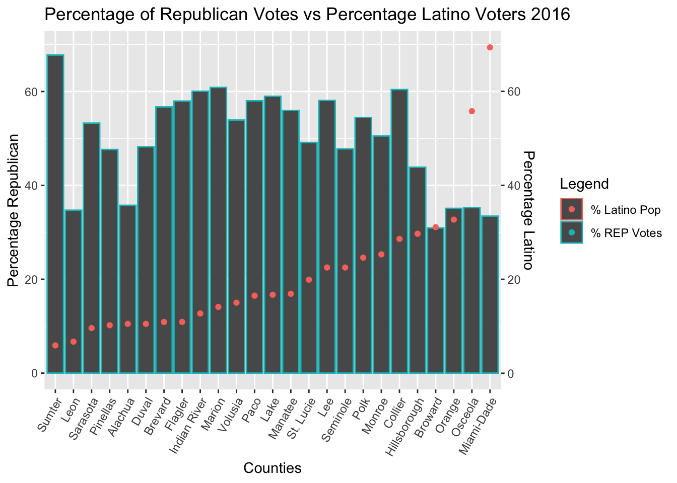
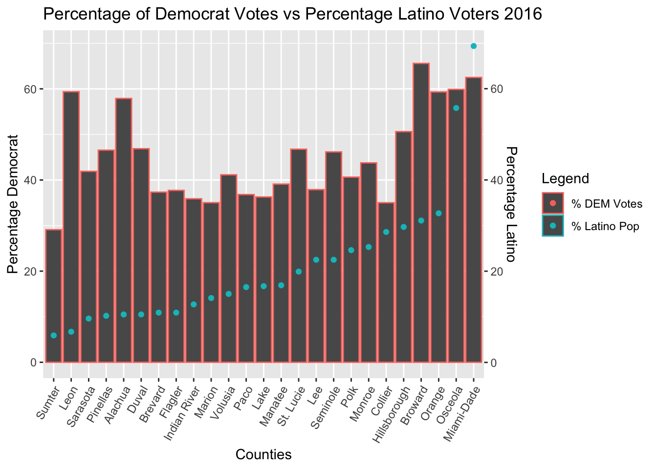
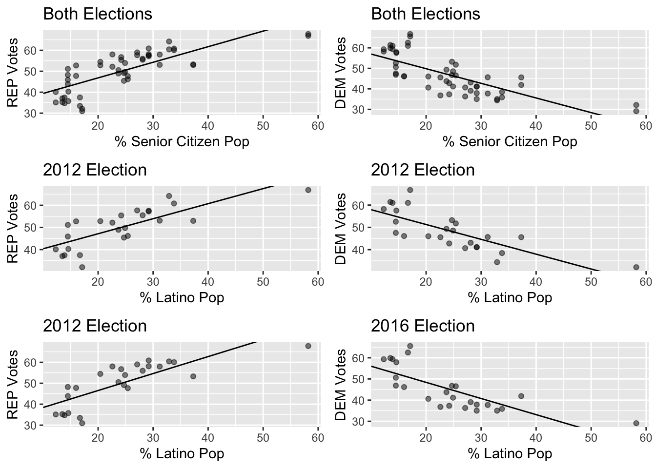
Linear Regression of Latino Population Data
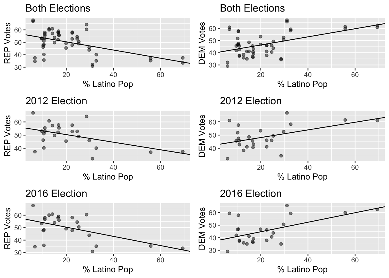 #### The Regression Results of Latino Voter Data showed that the strongest correlation between votes and voters occurred in the 2016 election #
| Election Ticket | Regression Equation | R-squared value | P-value |
|---|---|---|---|
| REP 2012 (Romney/Ryan) | y = -0.288x + 56.128 | 0.22838 | 0.0157 |
| DEM 2012 (Obama/Biden) | y = 0.289x + 42.341 | 0.234903 | 0.0141 |
| REP 2016 (Trump/Pence) | y = -0.370x + 57.780 | 0.27620 | 0.00698 |
| DEM 2016 (Clinton/Kaine) | y = 0.379x + 37.145 | 0.30333 | 0.00433 |
Counties with more Latino residents broke more strongly for Clinton in 2016 than for Obama in 2012 but not by a large margin. There is a statistically significant linear correlation between these variables in both elections.
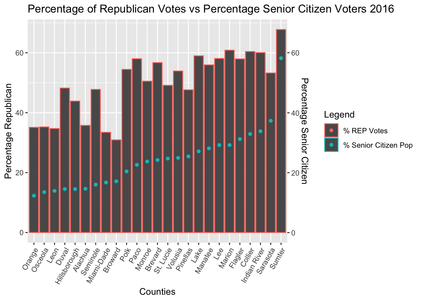
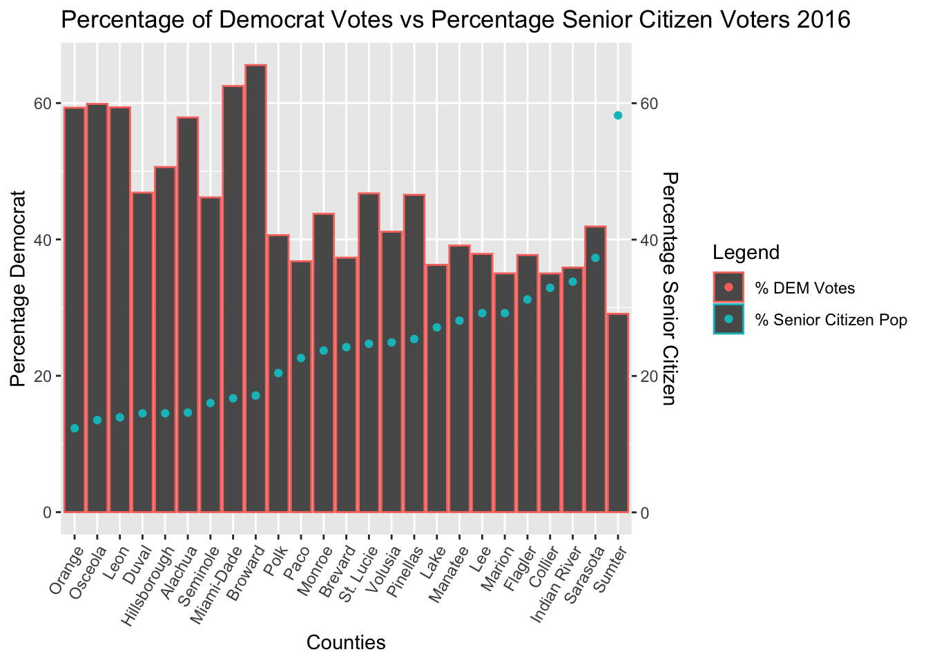
Linear Regression of Senior Citizen Population Data
| Election Ticket | Regression Equation | R-squared value | P-value |
|---|---|---|---|
| REP 2012 (Romney/Ryan) | y = 0.678x + 33.584 | 0.58837 | 7.708e-06 |
| DEM 2012 (Obama/Biden) | y = -0.666x + 64.594 | 0.57978 | 9.838e-06 |
| REP 2016 (Trump/Pence) | y = 0.810x + 30.325 | 0.61653 | 3.342e-06 |
| DEM 2016 (Clinton/Kaine) | y = -0.763x + 63.647 | 0.57276 | 1.197e-05 |
The Regression Results of Senior Citizen Voter Data showed that the strongest correlation between votes and voters occurred in the 2016 election. Also, elderly voters broke much harder for Trump in 2016 than they did for Romney in 2012, as evidenced by the stronger and significantly more positive linear correlation in 2016. There is a statistically significant linear correlation between these variables.
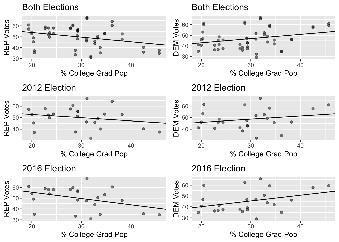
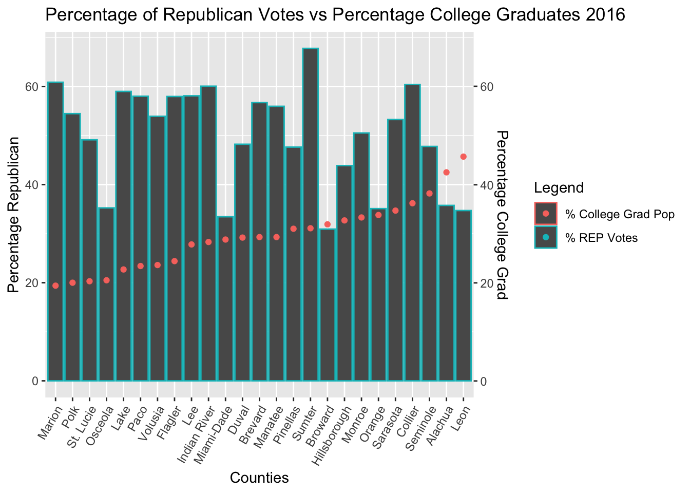
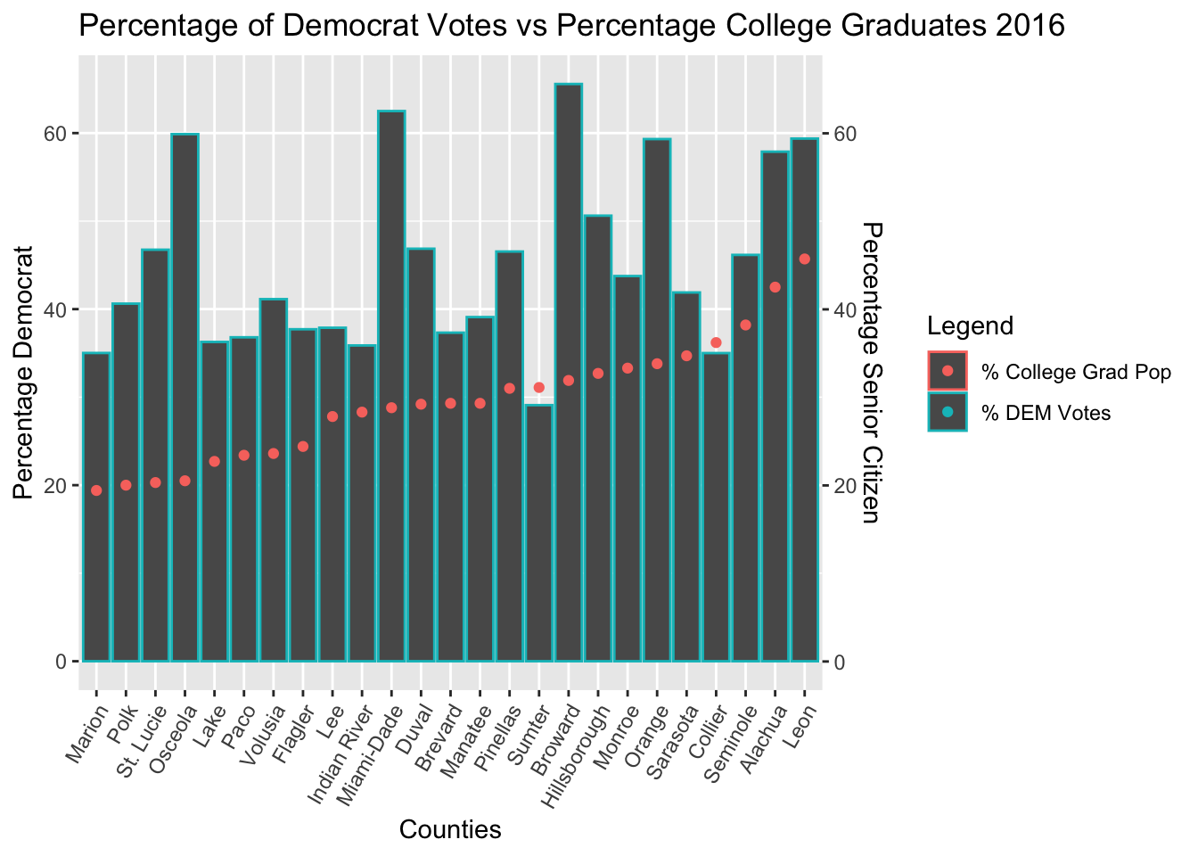
Linear Regression of College Graduate Population Data
| Election Ticket | Regression Equation | R-squared value | P-value |
|---|---|---|---|
| REP 2012 (Romney/Ryan) | y = -0.278x + 58.227 | 0.04584 | 0.304 |
| DEM 2012 (Obama/Biden) | y = 0.274x + 40.380 | 0.045523 | 0.0553 |
| REP 2016 (Trump/Pence) | y = -0.587x + 67.290 | 0.15058 | 0.3058 |
| DEM 2016 (Clinton/Kaine) | y = 0.529x + 29.543 | 0.12798 | 0.079 |
The Regression Results of College Graduate Voter Data showed that the correlation between percentage college graguates and percentage DEM and REP votes was not statistically significant.
Conclusion
The data found that there was a significant correlation between demographics data and voting. The demographics data that had the most significant correlation with an increase in voting were Black Voters and Senior Citizen Voters. Both of these demographics also broke more strongly towards their favored parties in the 2016 elections. Counties with more senior citizens trended more heavily towards Donald Trump than Mitt Romney, and counties with black voters trended more heavily towards Hillary Clinton than Barack Obama. I deduced this because the slopes for the 2016 linear regression equations were larger, meaning the votes trended more heavily towards one party when that population demographic increased. This difference in data was likely due to the difference in candidates. Donald Trump was a candidate that appealed to conservative values with his motto “Make America Great Again.” These ideas are likely what appealed most to Elderly voters. Counties with black voters, despite the running of the first black president for reelection, appeared to favor Hillary Clinton more by percentage. This could be due to their mistrust of Donald Trump due to his many controversial and inflammatory comments, or inacurracies in the model that will be discussed later.
Another surprising result of this model is the apparent lack of correlation between a county’s Latino population and how that county voted, despite how large the Latino population is in Florida. This is likely due to the fact that Latinos encompass a large variety of people from different countries and regions. The term “latinos” is a very general term that could encompass people from Mexico, Cuba, Puerto Rico, Central America, and South America. Attempting to predict how these people will vote is therefore quite difficult, and pollsters should redefine the term in the future. Surprisingly, there was no statistically significant correlation between percentage college graduates in a county and how that county voted. This became an important distinction between Democratic and Republican voters in future elections, but this was not significant in the observed counties in Florida. If I were to redo this project, I would include more rural Florida counties to observe how class and education influenced these elections.
Some of the weaknesses of this model include the number of counties. Including more counties would enable me to show a greater correlation between demographics and voting choice. Also, it is difficult to say which demographic had the greatest effect on the election’s outcome in each county. You could say the largest proportion had the greatest effect, but there are several factors that influence voting, including economic standing age, and population density. Just because a county like Miami-Dade and Broward may have a greater number of Latino and back residents than white residents, impoverished minority communities often experience a lower voter turnout than affluent white communities due to gaps in education, class, and population density. Urban, inner-city, residents of Florida’s largest cities can often experience very long wait times due to the large population density and limited polling places.
Overall, this model had the expected results for each demographic based on typical polls and election results. However, it could have been built to show a more accurate depiction of the relationship between demographics and voting. Including more counties or more elections would have benefited the model greatly. This was a generally insightful and interesting project to develop, and this method of analyzing voters using the concepts of data anlysis and vizualization could be very helpful to pollsters and campaigns in the future. Lastly, the 2016 Election displayed stronger correlations in every case, along with voters from each demographic favoring the party they did in 2016 much more strongly. This tendency, for example, of counties with high percentages of white people to vote in higher numbers for the republican candidate in 2016, Donald Trump, portrays a significant divide developing in the American people, between people of different race, age, and economic standing. It is my hope that utilizing data techniques such as this model will notify candidates and parties of this growing divide, and that it will convince them not to worsen it by catering to their base, but to bring Americans together through bipartisan politics and cooperation.
Demographics Data: https://www.census.gov/quickfacts/fact/table/FL,US/RHI125219
White house photo: https://www.whitehouse.gov/get-involved/
Florida map photo: https://www.bbc.com/news/election-us-2016-37889032